Landing pages are the bread-and-butter of inbound marketing ... but some landing pages are a burnt piece of toast.
It's easy to create landing pages, but creating landing pages that convert is much more of a challenge.
There are some basic mistakes that sabotage your landing pages before they ever have a chance to be successful.
If your landing pages aren't converting how you expected, one of these 5 mistakes may be the culprit.
1. Cluttered Design
When it comes to landing pages, less is more. It's easy to fall into the trap of over-designing a landing page, but it's important to strip away all the excess noise to streamline your visitors into action. A one-second delay in loading your site can lower conversions by 7% and multiple offers on one landing page can decrease conversions by up to 266%.
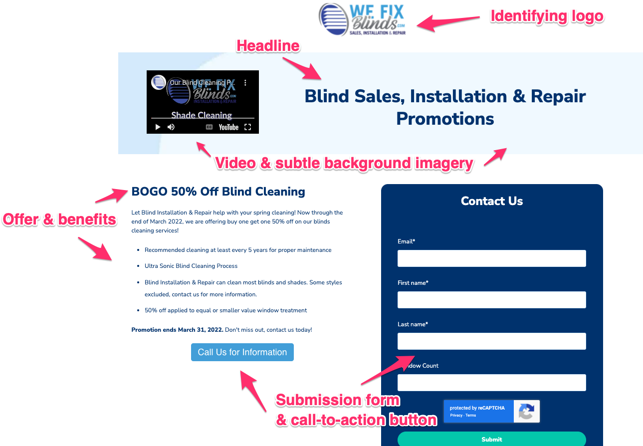
All high-converting landing pages have the same basic elements:
- Identifying logo
- Headline
- Image and/or Video
- Offer and benefits
- Button or form
Starting with these core elements will ensure a streamlined page. This example from a client's landing page shows this in action:

The landing page above is streamlined and easy to read. You can always add more in the future if you're not noticing conversions, but a good place to start is with a simple design and build up from there.
2. Weak Content
Language is arguably the most important element of your landing page, but often the most overlooked. Landing pages need to quickly communicate context and value to inspire action. Always make sure the content on your landing page is written with internet users in mind and make sure your headlines pop - you only have 8 seconds to make an impression.
The content needs to:
- Quickly and concisely convey the purpose of the landing page. Are users downloading an eBook? Registering for a webinar? Signing up for a demo?
- Make it clear why the offer is beneficial to the visitor. Why should they give you their personal information - what benefits will they get in exchange?
- Be broken up and easy to scan. Use of headers, bolded font, and bulleted lists make a landing page easy for the eye to read versus a block of dense text.
- Written for your audience. How you speak to a 22 year old social media manager for a restaurant versus a 53 year old CFO of a staffing agency are going to be different.
- Use clear language on buttons. Things like "click here" are not helpful - it should be obvious on each button what clicking it will do with words like "submit" "download" or "sign up."
If you aren't confident in your writing, we have some content tips that can help you craft killer headlines and page copy.
3. Unclear Calls-to-Action
At the end of the day, your landing page exists to make your visitors take an action. You won't see as many actions if your visitors don't know what to do.
Your calls-to-action (aka the buttons on your page) need to be unambiguous. Instead of "learn more," make your calls-to-action more relevant to what offer your landing page provides:
- Start a 14-Day Trial
- Download the eBook
- Try it for Free
- See Your Rates
Most readers will scan your landing page instead of reading in-depth, so the more obvious you can make your calls-to-action, the better. Likewise, your calls-to-action should be visually distinctive for the best chance of getting clicked. This means choosing a color that will pop against your page and sticking to easy-to-read font in a contrasting color.
4. Complicated Forms
Your forms and your calls-to-action work in tangent, which means your forms also need to be to-the-point. The average landing page has 11 form fields, but shortening your form fields from 11 to 4 can increase conversions by 120%.
The less information your prospects have to surrender upfront, the more likely they are to fill out your form.
Stick to the bare necessities - only the information you absolutely need to keep them moving through your sales process. When in doubt, the simplest place to begin is with the basics:
- First name
- Last name
That's all you need to get your foot in the door with contact information from a client, and makes them most likely to take the time to fill out your form.
5. Ignoring the Buyer's Journey
Landing pages are an important stepping stone in your buyer's journey. It's important to know what stage of the journey most people will be visiting your landing page and tailoring content accordingly.
Do they already know who you are? Or are they searching their need/problem on Google and finding your landing page? The answer to those questions will influence every element of your landing page from imagery to messaging.
Now that you know what mistakes to look for, take the time to go through your landing pages and make sure you haven't been sabotaging yourself. If you have, it's not too late to fix it.
Free Download: Everything You Ever Wanted to Know About Inbound Campaigns
Content is critical, and the best way to create compelling content is by providing value. Inbound campaigns help you find, target, and convert your ideal audience. Click "get my eBook" below to learn how to create buzz-worthy Inbound campaigns that drive action.
BizzyWeb is a Minneapolis-based digital marketing and web design agency that helps companies get the high-quality leads they need to grow and thrive. Our tactics include inbound marketing, SEO, advertising, web design, content creation and sales automation. We are an accredited HubSpot Platinum Partner and we offer full-service HubSpot onboarding, enablement and strategy for new and current users.


